UBR APP Homepage Update
From June to September 2024, I worked as a UX and Product Design Intern at Beijing Universal Beijing Resort (UBR), contributing to the product, system, and user experience design for UBR’s B2C website and mobile application.
The UBR Official APP is a key part of the digital experience, central to the visitor journey. It helps increase engagement, build brand loyalty, and drive conversions. We redesigned the homepage to improve information architecture, visual hierarchy, and interaction, simplifying the layout, optimizing navigation, and offering personalized recommendations to enhance user efficiency and satisfaction.
Key words: User Experience Optimization, APP Design, Commercial Conversion
Time
Jul. 2024-Sep.2024
Type
UX Design
Team
5 members
/ Background
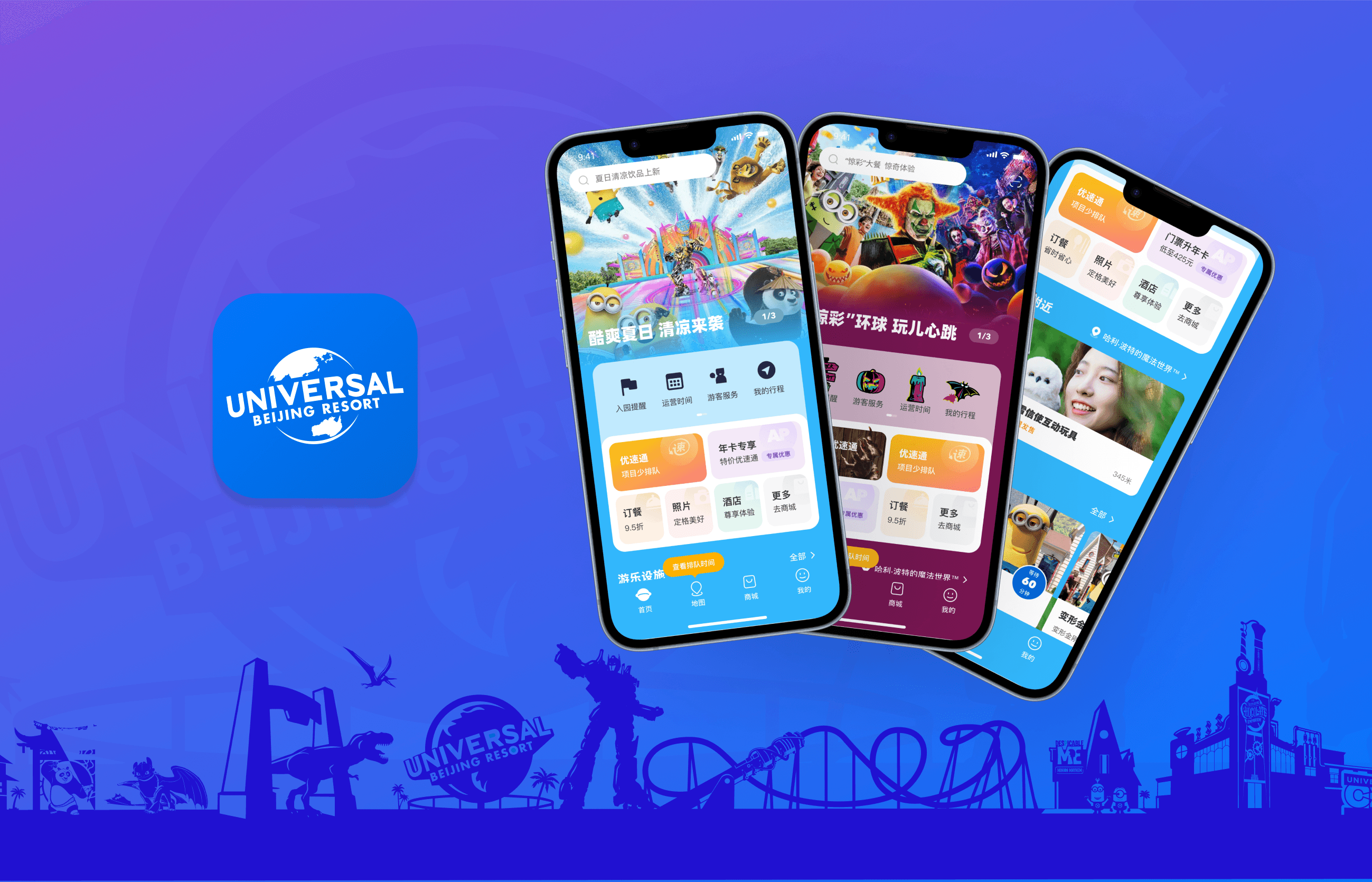
UBR Official APP
The Universal Beijing Resort Official APP is a complete digital platform designed to elevate the visitor experience. Acting as a central hub throughout the entire journey, it provides real-time information, navigation, and personalized services. Users can easily access park maps, check attraction wait times, book tickets, and make dining reservations, ensuring a seamless experience and helping them plan their visit more efficiently.


Universal Beijing Resort Official APP
Problem
As the main entry point for value-added services within the resort, the Beijing Universal Resort official app offers various services, including Express Pass, themed dining, and hotel bookings, which contribute significantly to the resort’s revenue, accounting for approximately 30% of total income. However, in the current design, these services are buried deep within the app's navigation, with complex pathways that make it difficult for many visitors to easily discover or even be aware of their existence. This not only impacts the visitor experience but also leads to a lower conversion rate.
Design Goal
By optimizing the visibility of value-added services and simplifying the user journey, we aim to enhance the overall user experience while boosting the conversion rate of these services.
/ Design Process
1
Current Product Analysis
Analyze competing products, assessing their strengths and weaknesses to inform potential improvements.
Develop strategies for redesigning the visual elements and restructuring the information architecture to enhance usability and navigation.
Create high-fidelity prototypes and finalize the interface design to align with the optimized strategy, ensuring an improved and cohesive user experience.
Analyze the current product by assessing user data to identify key issues that need optimization
2
Competitive Product Analysis
3
Define Optimization Strategy
4
Prototype and Visual Design
/ Current Product Analysis
APP Homepage Interface Analysis


Search bar
lacks prompts, leaving users unclear about the available search content.
Purchase Button
Value-added services are not adequately showcased on the homepage, leading to low user accessibility and engagement.
IP Display
The IP display area has a low click-through rate and could be replaced with a more engaging feature.
Park Information
The fixed order does not offer personalized information, resulting in a generic information for users.

Icon area
The icon priority is disorganized, with some important features being hidden.
/ Competitive Product Analysis
Shanghai Disney Resort APP
Pros
Cons
Clear distinction between pre-entry (booking), in-park (activities), and premium (membership) areas
This separation allows users to quickly find the functions they need, with automatic switching based on their entry status.
Low-density images occupy nearly half of the page These images take up significant space without offering much functional value, potentially reducing the overall content visibility.
Lack of dedicated space for event displays
Users are unable to quickly find out about the latest events, which could hinder engagement with ongoing activities.
Changlong APP
Pros
Rich product and discount information
There is a large amount of product and promotional content, which increases the potential for commercial conversions.
Highlighted offers with red bubbles
Key discounts are marked with red bubbles, making them easy to spot.

Cons
High information density with heavy advertising
The page is cluttered with advertisements, occupying over half of the screen space, which may overwhelm users and make it difficult to quickly identify key functions.
/ Define Optimization Strategy
Increased Commercial Conversion
Enhance the visibility of service offerings on the homepage, guiding users toward discovering new value-added services and increasing overall conversion rates.
Personalized Recommendations & Adaptive Modes
Adjust content and recommendations based on user status (entry, membership, seasonal events) for a personalized experience.
Maintain design consistency
Ensure the app's visual and interaction design remains consistent to prevent user confusion and preserve brand identity.
Enhanced Functional Segmentation & Improved Page Hierarchy
Clearly separate utility tools from service-based features, with an emphasis on service-related content to enhance usability and discoverability.
/ Prototype and Visual Design


Search bar
Recommended content appears in the search bar, guiding users to utilize the search function while increasing the visibility of services.
In the redesign of the general mode, I retained the previous visual style and most of the modules to ensure continuity and maintain user familiarity. To enhance service visibility, I introduced a tile section, while the IP display area was moved to the bottom, allowing interested users to scroll down for exploration.
After entering the park, the content in the icon and tile sections will be adjusted to meet the user's needs during their visit. Additionally, products or services will be recommended based on the user's location.
If the user holds an AP, some functions in the tile section will be transformed into recommendations for AP upgrades or exclusive AP services.
During special festivals or events, the homepage will transform into a themed page corresponding to the event, with icon styles and tile section content aligned with the holiday, enhancing the user's sense of immersion.
Carousel area
Integrate the IP character display into the carousel to create a cleaner layout while maintaining brand appeal.
Icon area
Separate service-related features into the tile area, while keeping the icon area dedicated to tools only.
Icon area
The icons will be rearranged into a more park-friendly order to enhance the user experience.
Tile area
Enhance the visibility of value-added services through the tile area, enabling users to quickly access and purchase them.
Tile area
The tiles will be rearranged into a more park-friendly order to enhance the user experience.
Explore Nearby
Recommend nearby services or products based on the user's location within the park, displaying the distance.
Park Informationa
The queue times for attractions are sorted by proximity to the user and display the distance, while the showtimes are sorted by the remaining time and also display the distance.
Before Entry
Before Entry
After Entry
After Entry
Floating Prompt
Add a floating jump prompt to guide users to click and explore more service offerings.
General Mode (Before Entry)
AP (annual pass) Mode
Festival Mode
Park Mode (After Entry)


